Building a simple room color palette doesn’t require any swatches or store visits. Scan your space and pinpoint the hues that are hard to replace or costly to change: the flooring, a sofa, a large bookcase, the curtains you want to keep, or the type of finish on the walls. These are the foundation of the room’s palette, and it’s generally easier to start here than to start by picking multiple new shades and then figuring out what to match.
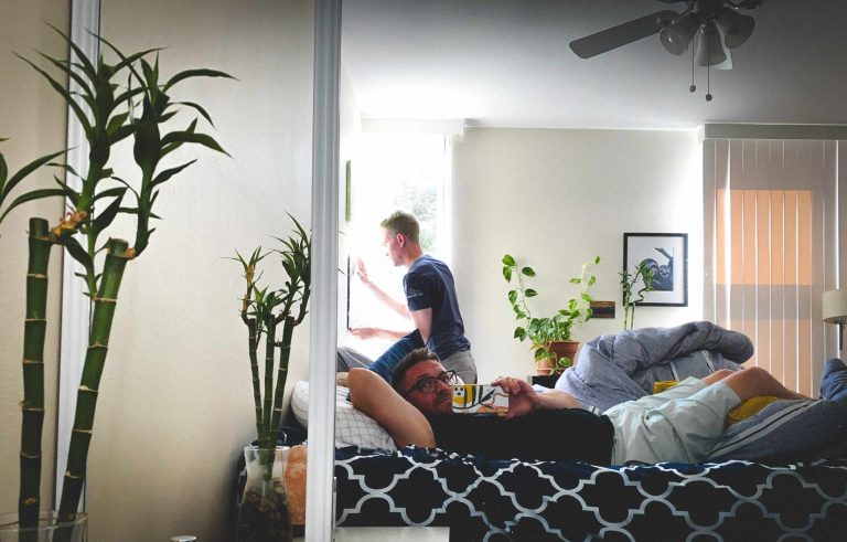
Take photos of the room in natural light and step away from it. Sometimes seeing the room in a photograph helps you better notice the colors that are repeating. Maybe there’s a warm wood floor, a grayish couch, and a few items in a subtle green. Pick out a neutral, a secondary color, and an accent. Don’t try to make everything look the same, just make sure that there’s enough repetition among the different items so that they feel cohesive.
The undertones of colors matter, even when they’re similar colors. For instance, two different beige textiles might clash if one is warm yellow-based and the other is gray- or pink-based. Bring samples of fabric, pillows, paint, or decor items near the furniture and floors they’ll live alongside. View them in natural light and in the lighting you’d normally use in the evenings. Some colors look good in a store but don’t translate well in warmer, indoor lighting.
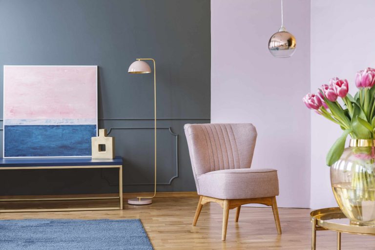
When you’ve chosen three primary colors, look at how they’re spread out. Usually, the neutral is the biggest color in terms of surface area, including the walls, floors, or larger pieces of furniture. The secondary color might show up in curtains, rugs, sofas, or in a few medium-sized items. An accent color works best in smaller doses, like on pillows, art, ceramics, or a blanket. This isn’t a hard rule, but you should consider the visual weight of the items. For example, a big dark blue rug will affect the palette more than a small blue vase, even if they share the same color.
One problem occurs when you find a great-looking item that happens to be a new color. A patterned pillow might have orange in it, a vase might have turquoise, and the artwork might be purple. Suddenly you’ve got too many accents. Before you get rid of those items for good, do a quick swap: take out the items that aren’t matching the other colors, snap a picture, and bring them back one at a time. See if each item contributes to the existing color story or if it’s a color that is unique to that item. This also demonstrates why negative space is so important.
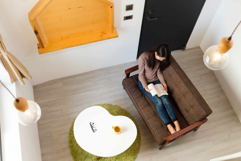
Texture is key to making a color palette feel interesting. The same room could include cream, brown, and muted green colors, but also linens, wool, ceramics, wood, glass, and metal. Texture provides variety without needing additional bright colors. Similarly, multiple wood tones or a touch of one metal finish in various parts of the room gives the room a feeling of continuity. Don’t try to match all the finishes perfectly, as that could make the room feel a bit forced.
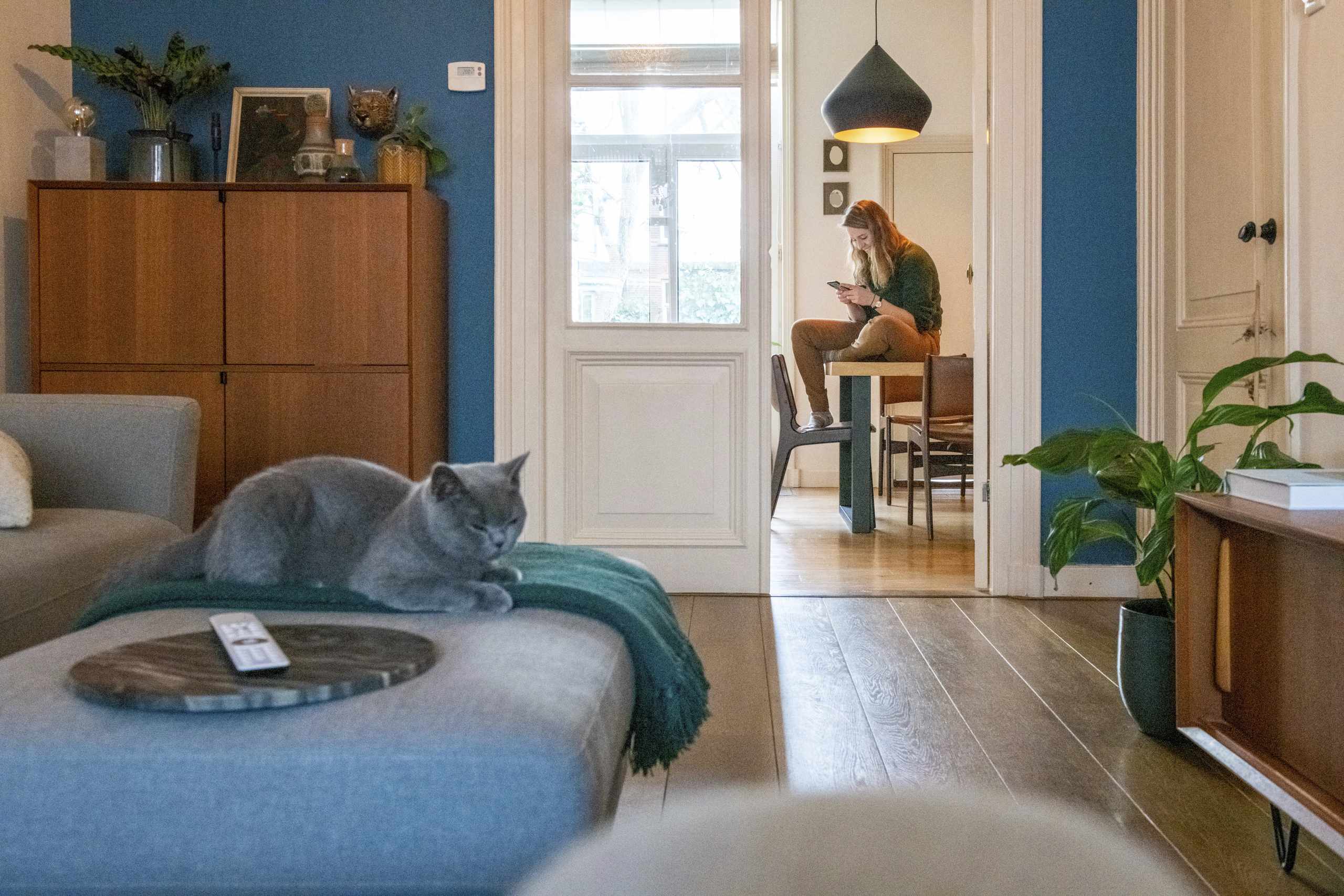
Before you buy another decorative item, ask yourself if you can articulate the color palette clearly and point to examples in the room. Then stand in the doorway of the room and look around, or view the room in a photo. If one accent color stands out too much, you might need to remove or rearrange something before you bring in more items. Knowing if your color palette is working will be much easier when there are multiple colors being repeated at different scales and textures, while still maintaining some negative space.