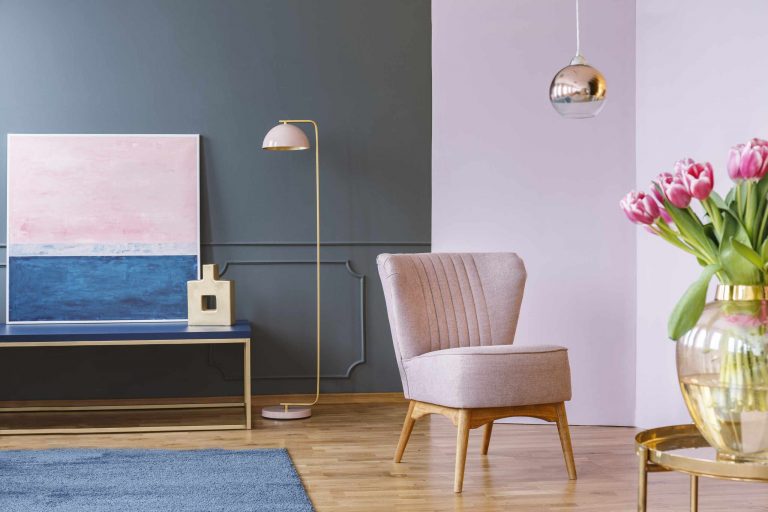
It’s possible for a print to fit perfectly in the frame, coordinate with the rest of the room, yet still somehow feel out of place. Maybe it’s the height. If a painting is hung too high over a couch, console table, or bed, then the gap between the furniture and the bottom of the frame feels disjointed. Your walls will start to feel segmented rather than cohesive.
It’s better to think of your art in terms of furniture placement, rather than in terms of ceiling placement. While art on a blank wall can be placed according to sight lines and wall proportions, a picture hanging over a couch should relate visually to the couch. We’re more concerned with the center of the artwork than the top edge of it. We want to focus on where people will look at it, rather than how much wall is left over.
Scale also plays a role. A small frame hung way too high above a large couch will only accentuate its tiny scale. A bigger piece, or a gallery wall, may have enough mass to relate to the furniture. Before you go out and buy something new, take a look and see if it’s a question of size, height, or both. Lowering it a bit might be all it takes to create a stronger relationship between the furniture and the art.
If you’re unsure about where to hang art, cut a paper cut-out of the dimensions of the piece, and tape it to the wall. Slide the cut-out up and down until you find a good spot (this way you won’t need to put extra holes in the wall). Then step back and view it from a few angles. Snap a photo of each variation. You might think that a couple of inches makes no difference, but seeing the entire wall will give you a better idea of how it looks.
Gallery walls are another thing that requires attention to height, but we treat it like one big picture. So, rather than positioning individual frames at different heights, create a box around the entire arrangement. Try to keep the spaces between them roughly equal, and think of where the center of the whole composition sits. When you’re pushing the uppermost frames higher than you’d like just to fill in space, it’s time to rethink. That means rethinking your relationship with the furniture beneath it.
Finally, you might find yourself hanging art directly above the furniture, but in cases where it doesn’t sit on a large scale, such as a long wall with a console table, or a bed, it can look strange. It’s best to center the art on the furniture, rather than on the wall. The wall plays an important role, but the art will have a better relationship with the furniture.
Step back, take a look at the furniture, the art, and the empty space between them, and see them as one shape. If the first thing you notice is the huge chunk of wall space between the frame and the furniture, it’s time to lower the art. When it begins to look like one composition, rather than two separate things on the wall, you’ve got the right height.